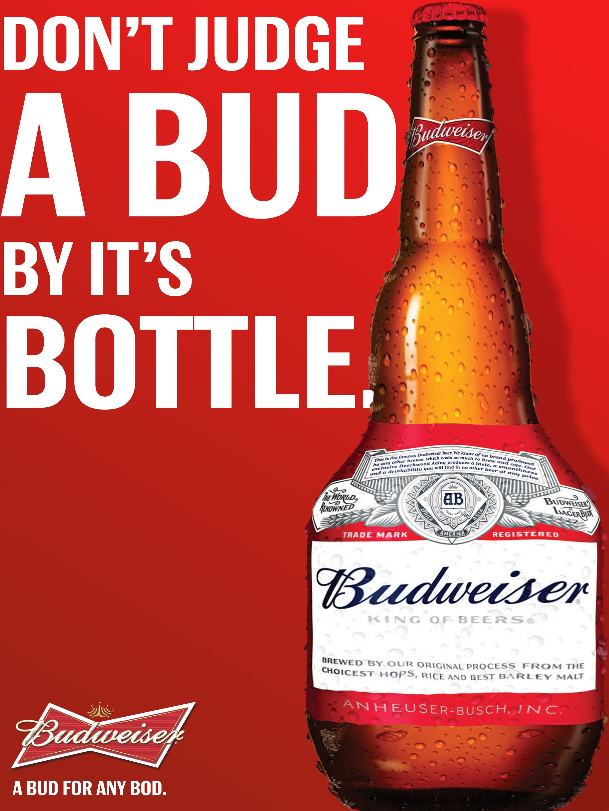
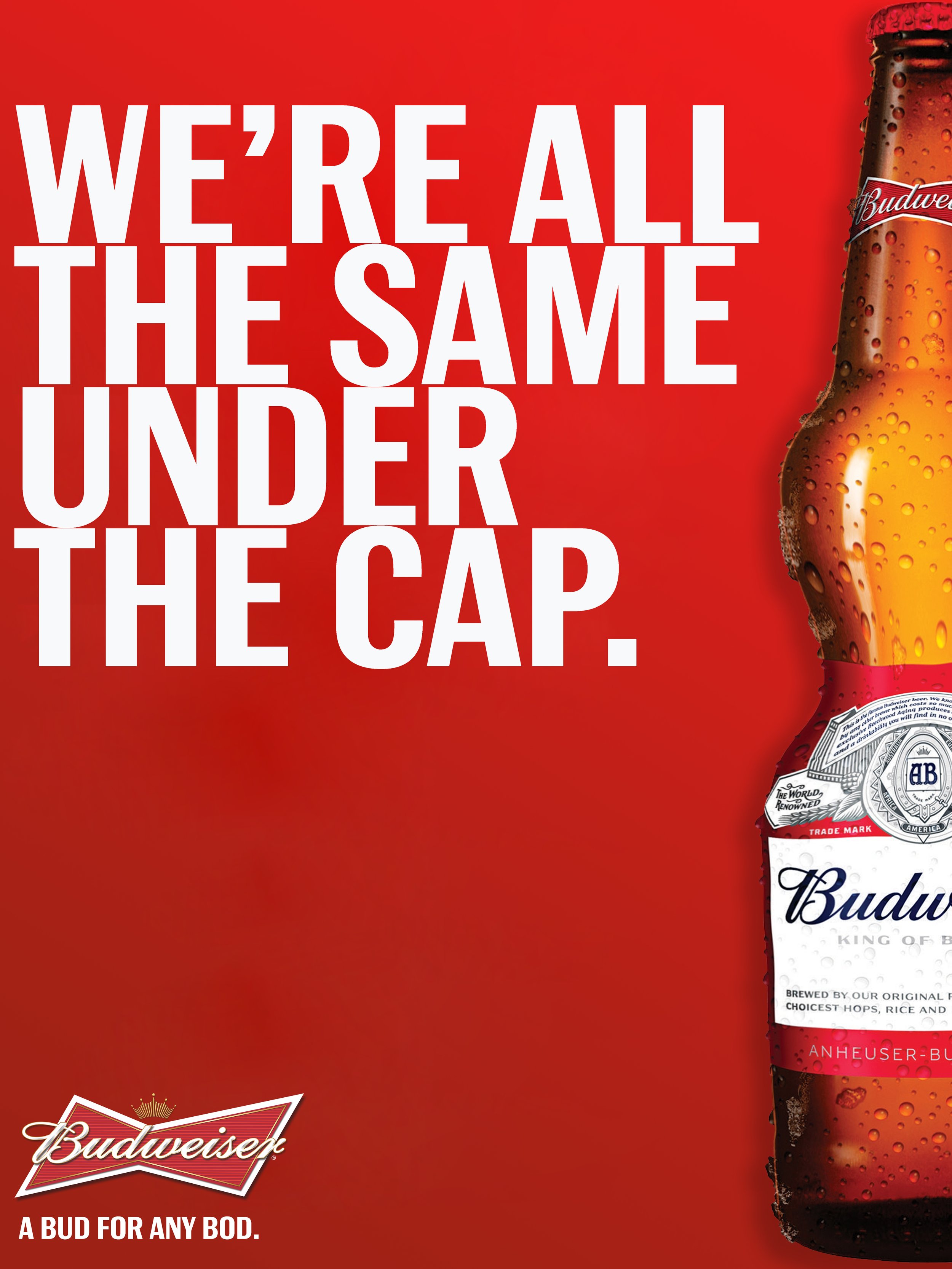
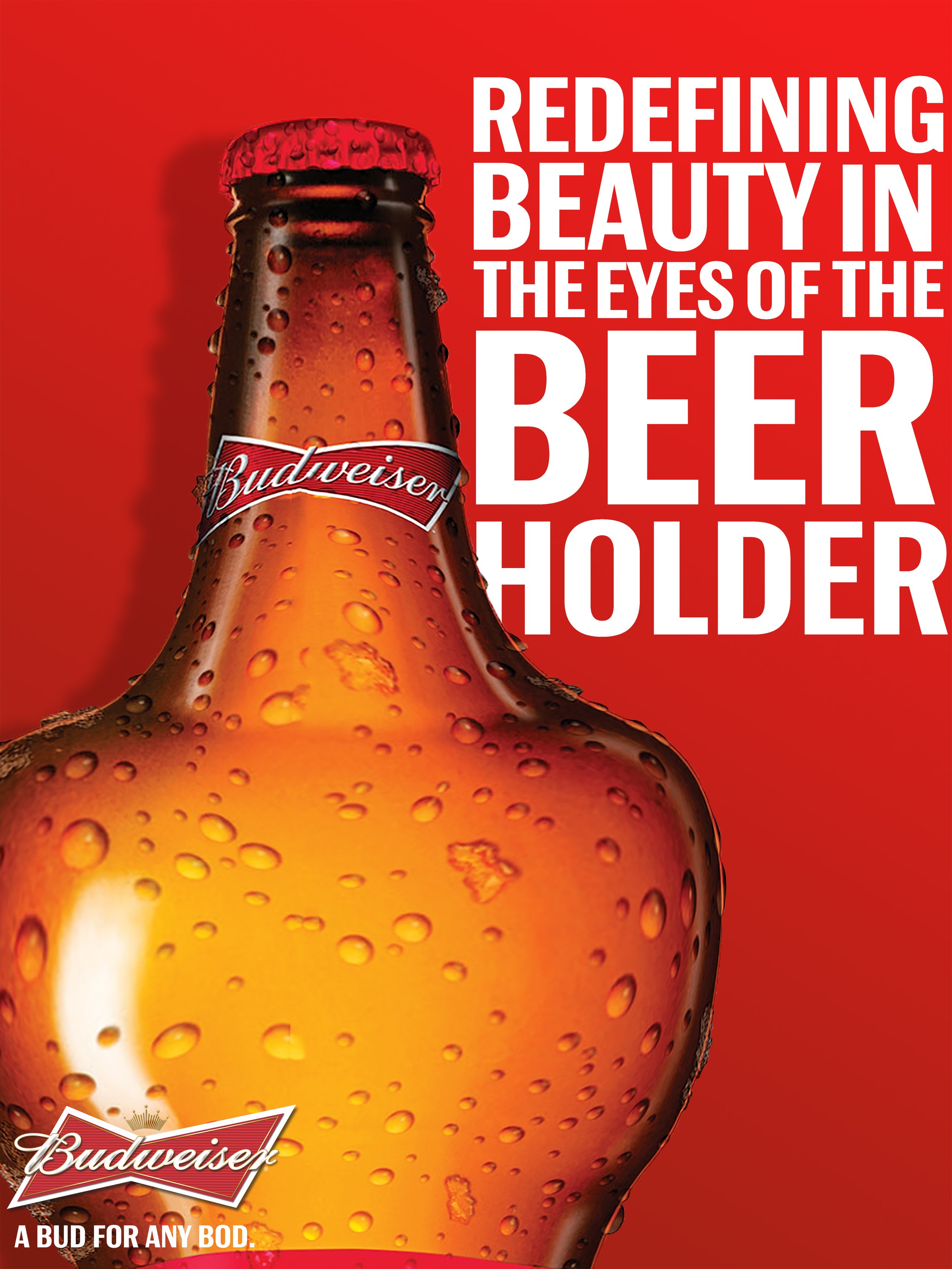
A Bud For Any Bod.
Challenge: People perceive Budweiser to be a very heavy beer, consumers refer to us as “Bud Heavy” and see us as a “Dad beer”.
Insight: Our plan to appeal to the 21-34 audience was to take Budweiser’s issue of being deemed a “heavy beer” and incorporate themes of body positivity. We redesigned the bottle’s traditional shape to represent different and more diverse body types, modeled after the apple, pear, hourglass, and inverted triangle shapes. They would market these bottles as individual limited edition collectables, encouraging a continuous buying incentive.
Young people are pro-body positivity and respond well to companies such as Aerie and Dove who encourage redefining the traditional representations of beauty. They have also responded positively to Budweiser’s more progressive campaigns and messaging (sustainability initiatives, diversity and inclusion initiatives) making this a beneficial campaign for brand image while turning the ‘heavy’ perceptions into a positive.
Art Direction | Anika Utke & Elizabeth Klayman
Copy | Cooper Dinowitz